
I don’t know if this second season of Dagashi Kashi is going to be a case of “be careful what you wish for” or not. In fact, I think a lot of the manga fans who whined through the first season will probably be happy with this second season, which gives them exactly what they said they wanted. Or maybe not – could be this fanbase is never going to be satisfied with any anime version of Dagashi Kashi.
Fundamentally, I think the shift to half-length is symbolic of the change that’s happened with the series as a whole. In the first season Takayanagi Shigehito undoubtedly tweaked the formula – and if he hadn’t, Dagashi Kashi would never have worked as a full-length anime. Die-hards derided him and it – fair game, that’s their right. What we have under Kuwahara Satoshi (and Tezuka Productions, who’ve taken over from .feel) is a more literal version of what’s basically a gag manga. And that’s fine, for what it is – but it would never work at 22 minutes.
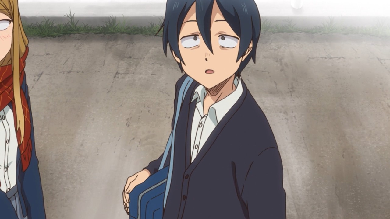
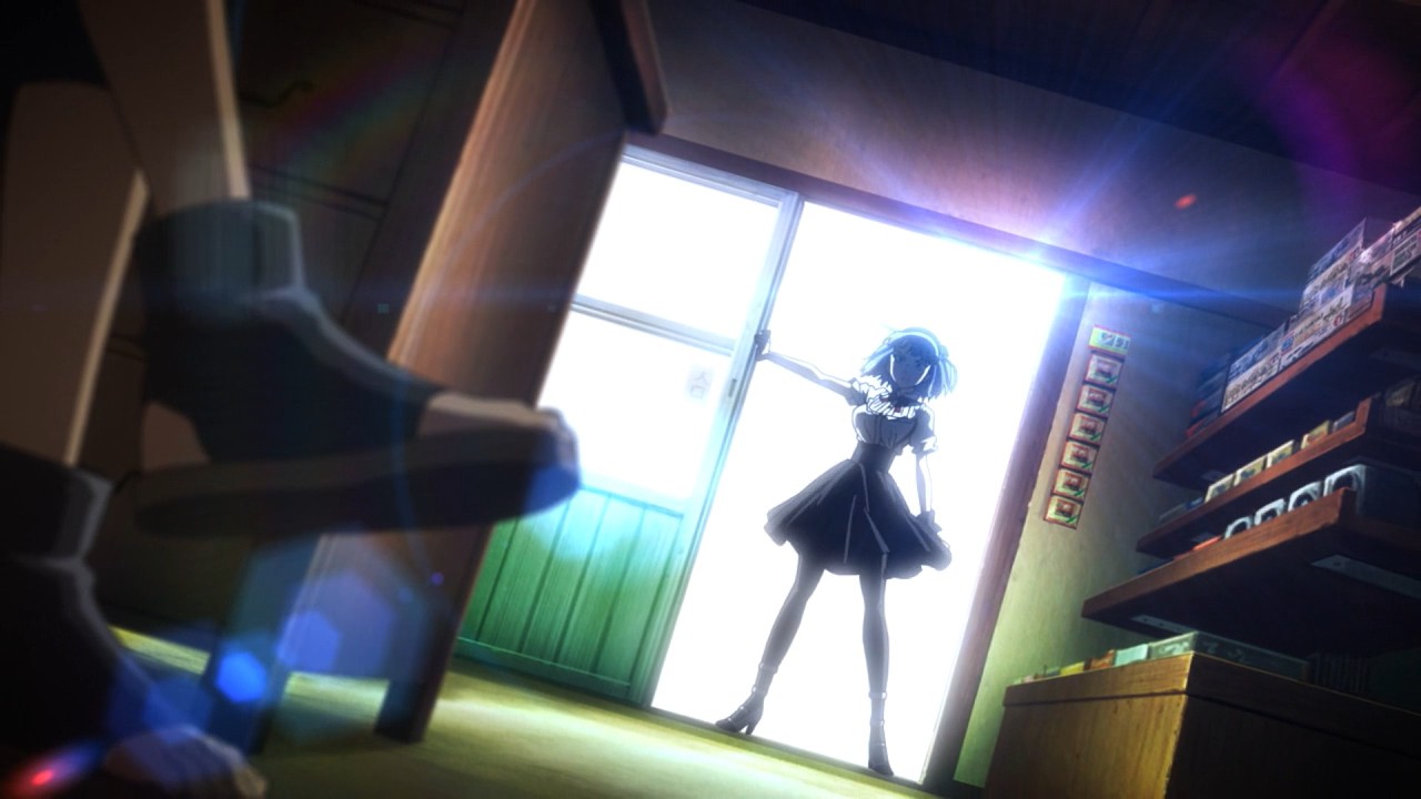
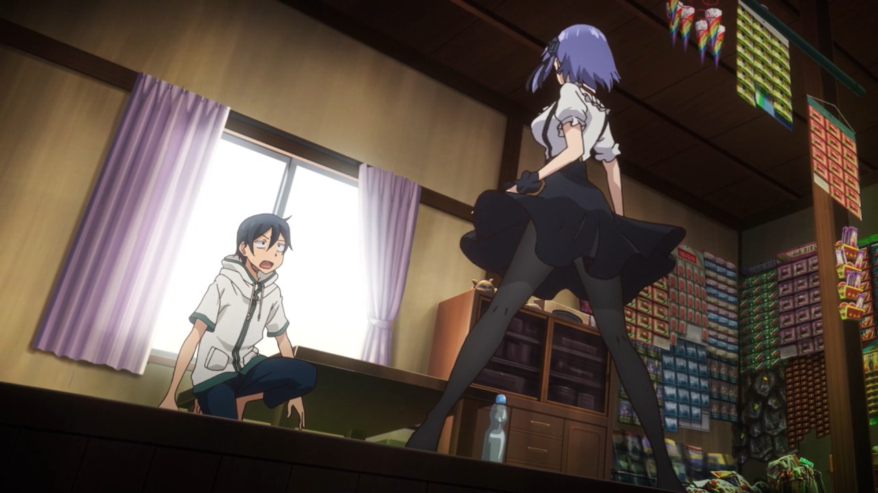
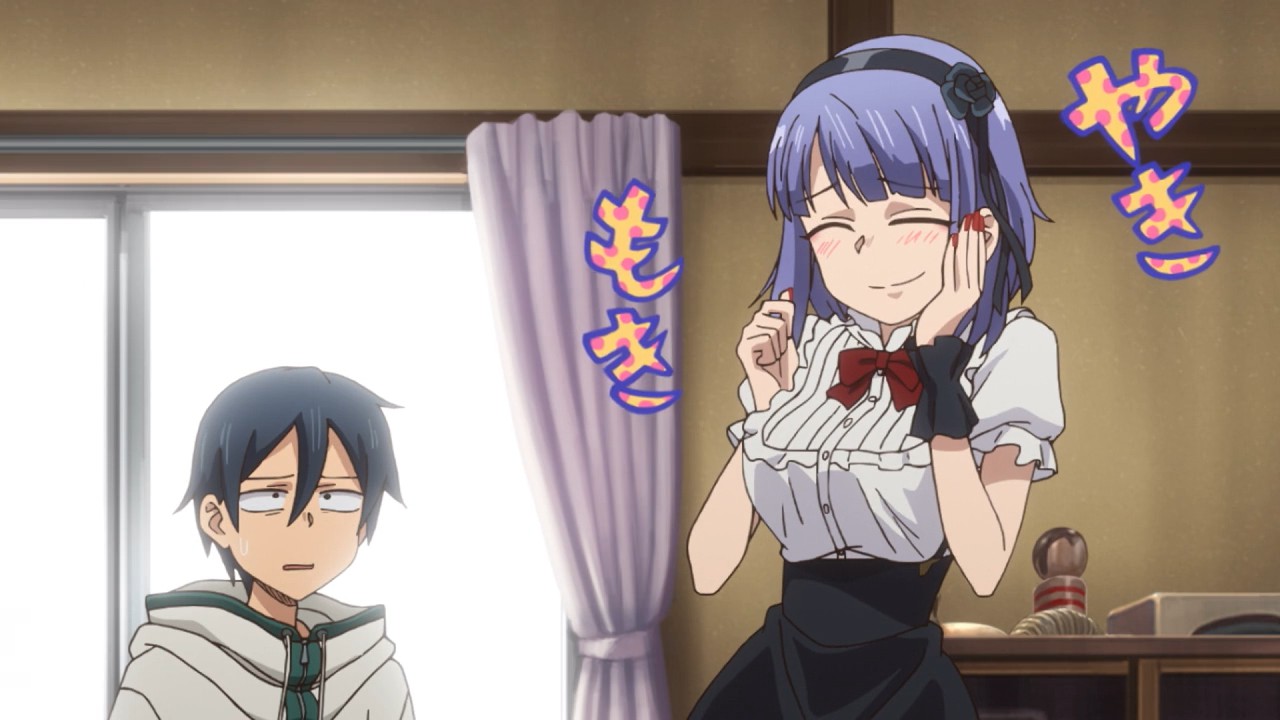
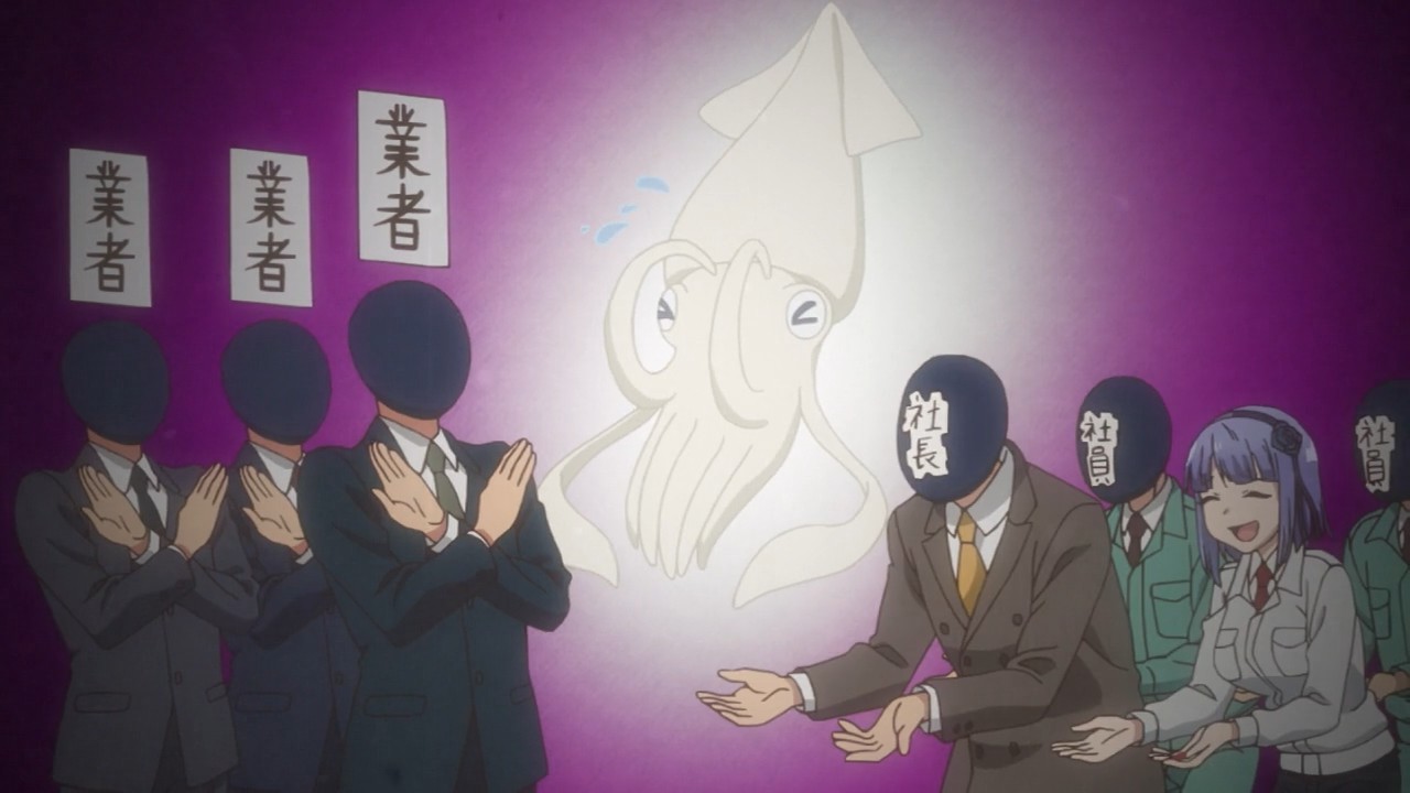
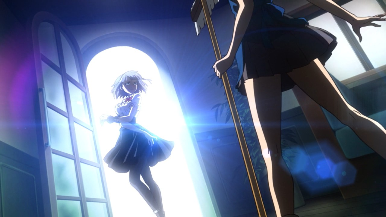
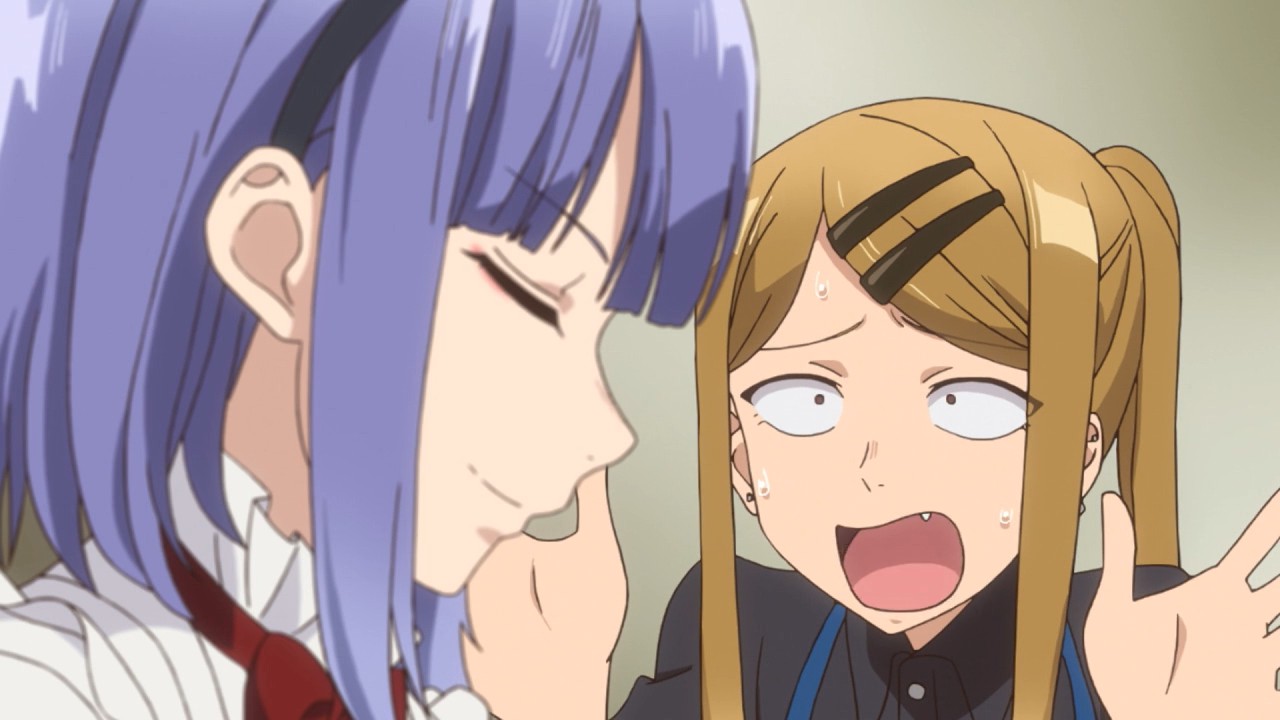
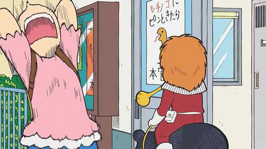
While I think Takayangi’s talent has been largely validated by the success of Kekkai Sensen & Beyond, he’s irrelevant to Dagashi Kashi 2. The series in its current form is more visually conventional (Kuwahara is clearly not a proponent of using depth and perspective the way his predecessor did), and so far at least much faster-paced. In the first season the small town setting and its sense of idyll was very much a character in its own right – now, things happen in machine gun fashion. In effect, Dagashi Kashi has been stripped of all the styling and characterization .feel added and reduced to its core essence – namely Hotaru vamping and lots of trivia about snacks.
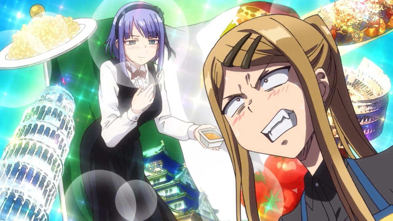
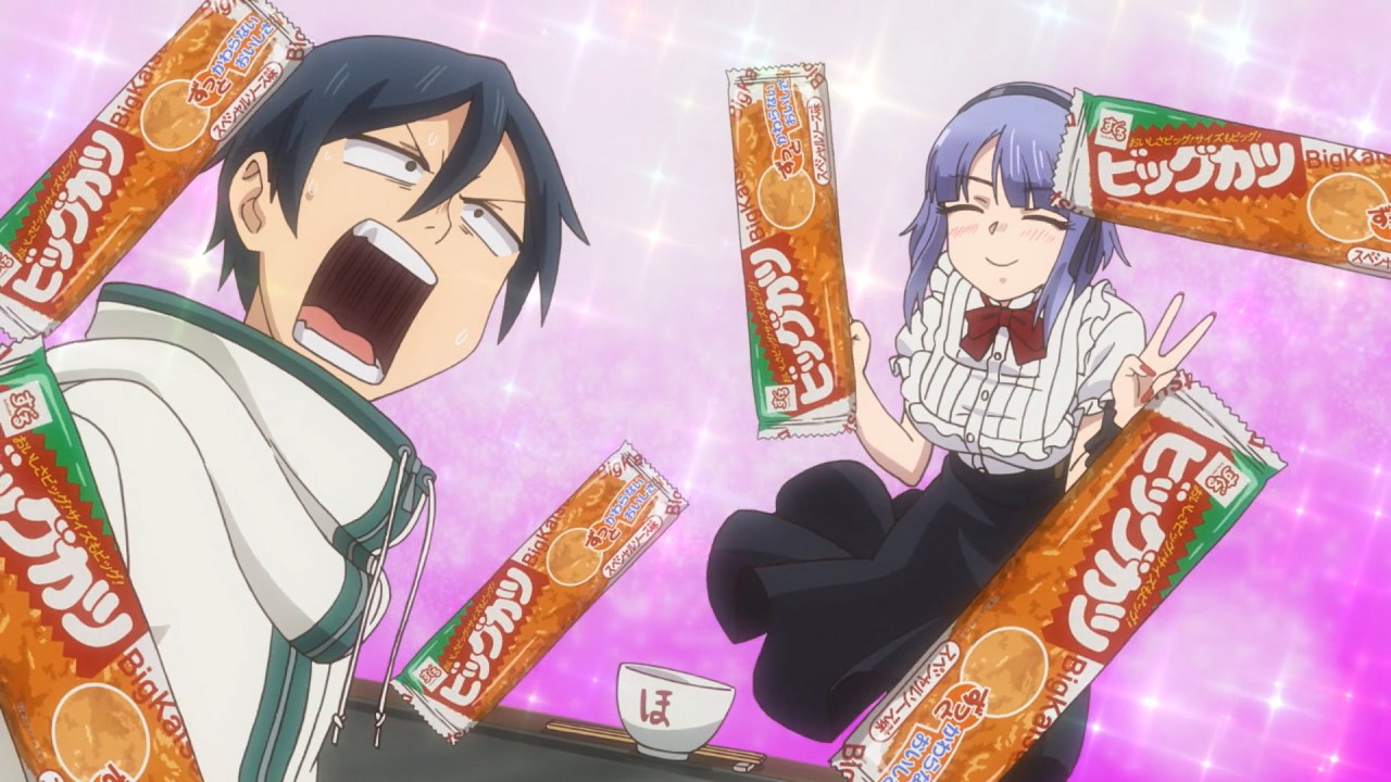
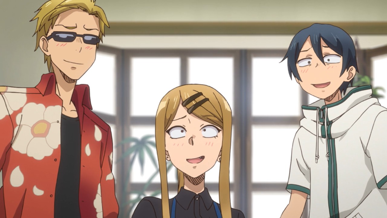
The season kicks off with two decidedly savory selections – “Big Katsu” and “Peperoncino” (which is really thinly-disguised cub yakisoba). For the record I’ve never heard of either one, and I think I’m with Coconuts on the first one – a dried fish cake is no substitute for tonkatsu. The Peperoncino OTOH at least looks novel, for all that its just yakisoba with a tricolore on the box. It’s all fun, of course – Hotaru is Hotaru, and that whole “Fu!” business made me laugh. But the real test for Dagashi Kashi 2 is going to come when it has to do at least a little more in terms of plot and character to move the narrative forward. I’m hopeful and I suspect this show will always be good fun at the very least, but I’d be lying if I said it didn’t seem as if something’s missing. Which in the literal sense, of course, it is.
sonicsenryaku
January 14, 2018 at 7:31 pm“In the first season the small town setting and its sense of idyll was very much a character in its own right ”
THIS!! I had mentioned in stilts write-up of the first episode that i was gonna give this season a few more episodes before levying some of my other criticisms but you pretty much mentioned it right off the bat. One of the main reasons why i found the first season to be a delightful viewing investment was because of how it handled the infectious melancholy that is trying to find ways to spend your time jovially in the empty countryside. Watching Coconuts and Saya roast away in the summer heat asking each other whether they had finished their summer homework while idly waiting by for something to happen in their quiet country home added to the whole charm of Hotaru always busting in brighten up their day. Takayanagi and his crew made sure to detail that part of the storytelling so that the eccentric dagashi skits had more oomph. Time was taken to establish the setting and allow the viewer to experience the day-to-day musings of country life I didn’t really feel that with this premiere. Granted it’s just the first ep which is why i want to wait a bit before locking in that criticism; but beyond that, the visuals also aren’t as vivid when compared to the first season. That’s not to say that the first season had the best visual pedigree in the world but it knew how to sell the strengths of the character designs and the country landscape. I had mentioned in the RC post that the designs looked flatter and lack the line work of season 1’s designs. The color palettes aren’t as punctuated and the faces have been elongated and made more angular, losing a bit of their innate expressiveness during subtler moments. Basically, the visuals have been nerfed with no real payoff…which is a letdown. Look at Hotaru’s design from season 1 and compare it to her season 2 look (saya also); that’s all you need to see the difference.
sonicsenryaku
January 14, 2018 at 7:47 pmOh and forgot to mention how much i miss the first season’s OP; it was this nice blend of light funk and j-pop that was catchy all hell with some neat visual direction to boot. Season 2’s OP is just that same ole high-energy generic j-pop we’re used to and I guess that’s okaaaaay???………….it’s a bit of a letdown. Again, I though this premiere was alright; it’s not that far off from season 1 in terms of tone or execution (sort of) but it’s missing some pieces that ultimately didn’t fleshed out my enjoyment the way season 1 did, at least from i got in this premiere. I guess we’ll wait n see; in hindsight, I wasn’t completely sold on the first ep of season 1 till i let it sit for a bit.
Guardian Enzo
January 14, 2018 at 8:04 pmYeah, I was aware of course that I was probably assuming a lot based on one episode. Still, the visual and tonal differences are pretty unmistakable here. My guts says the manga purists got what they wanted, and that’s just how it is. But there’a a sense of style and directorial flair that’s missing this time around, and I don’t really care whether it was “canon” or not.
sonicsenryaku
January 14, 2018 at 8:18 pmSame here
justfun
January 14, 2018 at 10:39 pmVery disappointing. I thought all the criticism of the first season was about Saya being highlighted, but if this first episode of season two is the essence of the manga, then it’s no more than a boring advertising show.
Dein
January 15, 2018 at 4:52 amI’ve never read the manga (as with most other shows) and while I liked the first season, it felt a bit drawn out for what it was. This new format seems to work better, but it might be too early to tell.