 |
 |
 |
Wow – where in the world to begin…
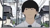
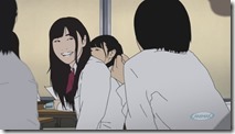
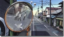
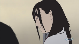
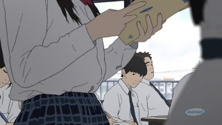
In a way, it seems only fitting that Zexcs chose to bring a manga that revels in the ugliness of human nature with an incredibly ugly visual style. On the other, there’s no denying that Aku no Hana is a really, really ugly anime to look at. In a medium that’s dominated by sanitized images of teenagers as almost unfailingly pretty and flawless of feature perhaps that’s not such a bad thing, but it doesn’t make the experience any more pleasant.
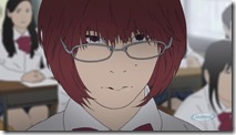
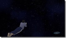
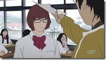
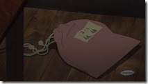
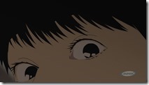
The irony is, I was already torn about watching this series in the first place, having read the manga, because while it possesses a sort of dark brilliance it’s definitely not pleasant to read. And Zexcs have managed to overshadow that with an intrusive and almost total reliance on rotoscoping. Effectively they seem to be trying to mount a live-action adaptation of Oshimi Shuuzou’s manga without paying to do so, but the result is a bit of a visual nightmare – faces disappearing at a distance, ghastly character designs (even from a girl whose beauty is an essential plot point) – leaving me to wonder how much of this is intentionally jarring and how much of it is just plain ugly.
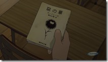
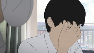
The man directing this weirdness is Nagahama Hiroshi, who brought the sublime Mushishi adaptation to the screen, and while there are elements of his spartan narrative and visual style that shine through, the experience is starkly different. The anime does a fine job of communicating the simmering unease in the story, the sense of impending disaster. As is the manga, the anime is by design an unpleasant place to be – following the mundane existence of tiresome adolescents and reveling in the restless unhappiness of its lead, Kasuga Takao (19 year-old newcomer Ueda Shinichirou, suitably naturalistic). A typically self-absorbed adolescent with delusions of grandeur, he absorbs himself in the poetry of Baudelaire and fosters a white-hot crush on class idol Saeki Nanako (Hikasa Youko).
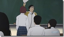
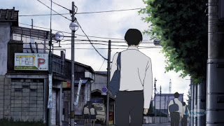
Most of the premiere is spent obsessing over the minute details of Kasuga’s routine and of the dreary small town in which he lives, but we get a brief taste of the real driver of events in the story – Nakamura Sawa (Ise Mariya, a long way from Killua here) when she calls her teacher a “piece of shit” after he mocks her for handing in a blank math test. I think even if you hadn’t read the manga you’d have a pretty good idea from the premiere that some crazy shit is coming down the pike, and that’s a credit to Nagahama-sensei’s direction. The whole experience is unsettling, and I suppose the relentlessly displeasing visuals play into that. The question again is, how much of that is intentional and how much of it is just plain ugly?
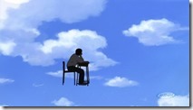
It’s certainly no exaggeration to say I’m still torn about Aku no Hana. I didn’t have an especially strong desire to see the events of the manga – the reading of which is already an act of masochism – brought to life, and I don’t especially enjoy the visual experience of the anime. But it’s certainly about as far from anime formula as you’re going to get, and that counts for something. This entire production could hardly be more strange, and everyone is going to have to decide for themselves both whether they want to endure it and whether the results in anime form are artistic choices or incompetence.
 |
 |
 |
 |
 |
 |
 |
 |
 |
 |
 |
 |



Maxulous
April 6, 2013 at 3:36 amI'm in all the way. Nagahama Hiroshi did DMC, so this is destined for misunderstood greatness.
The visuals fit perfectly to the tone, and the background cinematography was something out of a 90s anime. Reminiscent of the late Satoshi Kon I feel.
Maxulous
April 6, 2013 at 3:41 amThe fact that we're even seeing something like this come out of 2013 has left me a little dazed and confused, but mostly excited.
Zeta Zero
April 6, 2013 at 3:56 amUgly? That's a bit much don't you think? I take it you don't like realism very much, because this is closer to Japanese reality than more typical anime styles will ever be.
admin
April 6, 2013 at 3:59 amNo, not only do I not think it's a bit much but I think it's entirely intentional. The manga is a veritable celebration of ugliness in every way, from the physical to the spiritual.
Maxulous
April 6, 2013 at 4:01 amI actually felt a little more endeared since it closely captures the disparity.
Jeroz
April 6, 2013 at 6:32 amreality? yes, lack of shadows, lack of depth, low frame rate, and face popping. Those are all what real life looks like.
Zeta Zero
April 6, 2013 at 7:41 amI said "closer to reality" not one-hundred percent mimics reality.
Relativity. This looks relatively closer to reality than Robotics;Notes does.
admin
April 6, 2013 at 7:52 amRotoscoping at this level of skill appears less far less real than well-produced and detailed traditional animation as far as I'm concerned. If anything I think Aku no Hana is shocking people visually because it looks so jarringly unreal.
Maxulous
April 6, 2013 at 8:07 amWe're talking about people who watch a lot of stylized anime here.
litho
April 6, 2013 at 8:42 amDunno. I thought Kemonozume was beautiful, but consider this rather plain and ugly. There are some good points which I mentioned in my comment below, but….
ishruns
April 6, 2013 at 11:07 amIt just looks like the really horrible CG from the Berserk Reboot movies. I think fans of traditional (stylized if you wish but I think that this is stylized as stylized implies its going out of its way to be different, which Aku no Hana is) anime will have trouble with it.
But Im surprised GE has trouble with it considering he got through Kingdom.
I read 2 chapters of the manga and I don't want to read anymore. I think the kind of stories which intend to portray the shocking ugliness of humanity can be powerful and indeed Aku no Hana is but there's a line that should be tread to not disgust readers away but captivate them to be better people and the mangaka simply doesn't see that.
I don't know about anyone else but I find sincere characters being tortured by the world they exist in like in Gankutsuou or Bokurano to be worth a watch simply due to empathy and how easy it is to become attached to the characters. But I don't want to empathize with the people of Aku no Hana and I guess I'm out then.
elianthos80
April 6, 2013 at 11:13 am@litho: Kemonozume was great visually speaking. Even if some of the events depicted made a tad queasy occasionally, ahah.
I don't think Im going to dive into AnH after all. Not because of the visuals – frankly I don't find the anime design here ugly, but between not witnessing the effect in motion and Enzo possibly picking some of the best looking shots… – , but based on what I've read about its content. I don't really feel like revelling in the ugliness of human nature atm.
anotherbloodyanimeblog
April 6, 2013 at 4:13 amI was torn for all of about 3 minutes watching the first episode. Now I'm just excited, that first episode was god-tier.
Matt Sandvig
April 6, 2013 at 6:30 amI agree with you 100%, only I'm not torn at all. I adore this adaptation.
I love how willing the studio is to experimenting in order to convey the narrative. The use of rotoscopy serves not only as a look to how it could be done in the future (opening the door to more experimentation, something that you don't usually see outside of films like Mind Game or Genius Party), but it serves to highlight the key tone of the entire story.
The character designs evoke a sense of natural human aesthetics in a way that's not unlike the late Satoshi Kon's works. Humans aren't these pristine creatures, and the art style highlights that. Not only that, but the animation is a great way to make use of said art style, letting them make some very fluid animation. Kills two birds with one stone.
And it's so nice to see an anime take such a deliberate pace. They actually give us time with the characters before everything hits the fan. That's so important for a series like this to work, and I think they may have nailed it better than the original manga did. The talent behind Mushi-shi's adaptation are not to be underestimated, lol
Even the ending theme, which should never ever work, works precisely because it shouldn't. Just another in a long line of calculated efforts to leave the viewer unsettled.
I totally understand why people didn't like this episode for all its unsettling qualities; but I think that's really a shame, because this is exactly what the anime industry needs to do every once in a while. I'm absolutely enthralled to see something so experimental. And it worked so well.
admin
April 6, 2013 at 7:19 amI understand your point and even agree to an extent, which is why I share the belief that many viewers are missing the larger point of these artistic choices. They're choices – mostly.
But here's the problem. Just as the show's attackers are missing that point, the staunchest defenders are swallowing a lot that seems like simply shoddy work as being all in the name of art. This isn't trying for photo-realism – in life people's movements aren't jerky because of low frame rates and their faces don't disappear more than 10 feet away from you. Some of this is being done simply because it's cheap, and frankly, it's not especially skillful use of rotoscoping as compared to some.
This reminds me of SHAFT, in a way, using tricks to make up for a lack of animation quality and chalking it all up to stylistic choice. Sometimes it is, and sometimes it isn't.
Zeta Zero
April 6, 2013 at 7:20 amWell said.
Sometimes it takes being outside the comfort zone rather than constantly having one's hands held. Evangelion worked a little like this, albeit more thematically rather than visually. People may not like the results but an industry occasionally need a shove up the backside in order to stimulate change.
People talk about wanting something different, and well this is different.
Zeta Zero
April 6, 2013 at 7:23 amRotoscoping on a budget. It won't look as good as say A Scanner Darkly.
Regardless of how it looks I'll be judging this show primarily on its content.
Matt Sandvig
April 6, 2013 at 7:36 am@Enzo, I totally agree with what your saying.
I wasn't trying to imply that the style it's using is perfect. Hell, one of the key problems with it is that it can be really hard to pull off still shots using it (something that anime is typically known for). I distinctly remember two moments where a background character was just siting still with a creepy grin on their faces while everyone else was moving.
And yes, the use of rotoscopy here is very, how do I put it, "broad." They're obviously working on a budget, which explains the lack of detail in the character designs and the whole "face pop-in" thing. And it's clear that trying to capture complete human movement using rotoscopy in a 24fps video is going to have some problems.
When I said they were trying to evoke a certain natural human aesthetic, I was referring more to the unapologetic way they were showing the characters. They aren't going for photo realism, but I think they are going for a more "realistic perspective," if that makes sense.
And as far as the taking shortcuts are concerned, I totally agree with you yet again. It's undeniable. This is an unavoidable reality. You can see this even in some of the most lauded avant-garde anime films like the two that I mentioned (though to a relatively lesser extent, since they typically have more money to work with per scene). Artists wish they lived in an ideal world; but as you, I, and a lot of other people know, they've got very real constraints that they need to work within.
So, when it comes to works like Aku no Hana and those of Shinbo, I try to worry less about that common denominator and focus more on if the artistic merits make up for it. I ask if I think they've expressed what they wanted to, despite having to work under their often heavy constraints. And in both this and the Monogatari series, I think the answer is a resounding yes.
Maxulous
April 6, 2013 at 8:00 amI don't think we can start rubbing our noses into what is and what isn't without the information. What we can do is respond to what we're given. It was mentioned somewhere the director knew full well going in that his artistic choices would be meet with controversy. He took up this project embracing the liberty to make changes to the source material, that's more or less what inspired adaptations are about.
SixFlags
April 6, 2013 at 7:24 amThis episode left me quite speechless. I agree with you that for my taste the characters are far from pleasant. However it would be too early to drop the anime just because of that.
What strikes me most is how much different the anime feels from the manga. (Especially due to the lack of interaction with other classmates etc. in this episode) I don't know how adaptions are usually done, but it would be quite interesting to hear what the original manga artist thinks of this adaption. It actually wouldn't be surprising that the anime is even done with the consent of him, wouldn't it?
I am quite happy to wait for the next episode, when the main characters start to interact with other. I really wonder how the anime will present it to us.
admin
April 6, 2013 at 7:58 amThat of course brings up another issue with an adaptation like this one. In effect the studio is saying, "We don't think the manga is good or interesting enough to succeed on its own terms, so we're going to completely change it to the point of unrecognizablity." They have that right of course – they paid for it – and while I have no clue what the mangaka thinks in this case, he's very unlikely to say anything, since the more the anime succeeds the better it is for him financially and professionally.
Having read the manga myself, mixed as my feelings are about it I naturally would have been interested in seeing it brought to the screen in a way that's at least spiritually if not materially faithful to the look of the original. It's too early to say if they'll take as many liberties with the story.
Maxulous
April 6, 2013 at 8:02 amHe'd probably say: "Be sure to tune in next week, you pieces of shit."
mrkuuru
April 6, 2013 at 8:07 aman interview of the manga author http://forums.animesuki.com/showpost.php?p=4622098&postcount=169
admin
April 6, 2013 at 8:30 amYeah, like I said – the better the anime does, the better it is for him. The guy clearly is obviously not dumb enough to say anything negative that might undercut the anime's success (which faces a pretty huge uphill fight to begin with). He's doing exactly what you'd expect him to do.
Zeta Zero
April 6, 2013 at 8:34 amI've always agreed with the idea that adaptations shouldn't be word for word/scene for scene facsimiles of the source material. Otherwise you would just read the manga, book, whatever, rendering adaptations redundant.
SixFlags
April 6, 2013 at 8:37 amOh this interview is great! Thank you!
I guess the fact that mangaka & director were at least not working against each other (though I believe they wouldn't openly admit it anyway) is interesting. Hopefully its not heading towards something like "disturbing the audience only for the sake of disturbing".
admin
April 6, 2013 at 8:39 amI agree, and I know few who wouldn't. That's irrelevant because a separate question from changing a source material so much that it's effectively unrecognizable. There's a lot of space in between those two extremes.
I have no particular attachment to the manga – it's not Kaoru Mori caliber art by any stretch. Since I read it I would have been curious to see how it came off as a modestly faithful adaptation, that's all.
Maxulous
April 6, 2013 at 8:40 amWho is to say the opposite isn't true and that the IMPACT of the directing will lead the curious to the inevitably longer manga?
It's advertising either way.
Matt Sandvig
April 6, 2013 at 8:41 amI can definitely say that, no matter what else, I feel comfortable trusting the adaptation to this director. Mushi-shi remains one of my absolute favorite anime; and if this first episode is any indication, I'd say he knows what he's doing here.
Maxulous
April 6, 2013 at 8:46 amYes, I think taking the director's intentions to heart is far more relevant to this particular work than the mangaka's. In that sense this episode was a masterpiece.
kuromitsu
April 6, 2013 at 10:45 am>Enzo
I haven't read the manga and don't know Oshimi, but from this interview he doesn't come across as someone who is just trying to pay lip service to the anime. He knew what the end result would look like, and he's apparently pleased with it. And his message to the fans seems pretty sincere: those who really care about his manga will find the same qualities in the anime, but those who are into it for the pretty girls will be disappointed.
Frankly, I'm a bit baffled at people being so utterly taken aback by the visuals. (I wouldn't call them character designs because they're not, not really.) Sure, the show looks unconventional and it's definitely not pretty, but I don't think it's particularly ghastly at all. Given the effect the creators are trying to achieve, the characters look fine. In the context of the show it's easy to tell that the girls are supposed to be pretty, and for me that's enough. (Then again, one of my favorite manga is "Sex" by Kamijou Atsushi, that often employs tracing/semi-to-full realistic style, so I'm used to seeing people look like that in manga.)
And as for the actual animation quality, I have a mantra for this: "I survived episode 7 of Kemonozume, I'll survive everything." 😀 Compared to that, Aku no hana is KyoAni quality. I'm no fan of rotoscopy myself, but I won't drop a show I find interesting just because the animation is obviously done on a budget. (If that was the case I would've dropped Shinsekai yori right at the beginning…) Btw, as for disappearing faces, you get those in traditional, budget anime as well, and even more so in manga, so… It's not "nice" but I honestly don't get why it is such a huge issue.
Anyway, all this uproar about how ugly Aku no hana looks reminds me of the reactions to Noein and Kemonozume, people dropping them and bashing them because they looked "ugly." Too bad, because both of them turned out to be awesome shows.
admin
April 6, 2013 at 8:58 amMatt, Mushishi may be in my top 10 of all-time so yes, I do place a lot of trust in Nagahama based on that.
The larger issue of really badly-done animation remains, though. I don't think we can hold an anime from a notoriously low-quality studio up to the standard of a Hollywood film – even an indie one – but yes, whatever you think of the idea of using rotoscoping, the execution in Aku no Hana simply isn't very good. It's clumsy, bare-bones work.
To some extent I give Nagahama credit here for a courageous move – I would guess there was a calculation made that since this was Zexcs and probably had a very tight budget, since the animation was going to be crap anyway they might as well go for something completely unexpected and claim it was all on purpose. And it's worked – I don't think there's any way Aku no Hana would have gotten this kind of attention if it had been the usual Zexcs mediocrity when it came to visuals.
Again, I think there's a lot of parallel to a SHAFT release here, as people are falling all over themselves to sound edgy by embracing all this money-saving trickery as a bold artistic choice. But sometimes a cigar is just a cigar, and sometimes crap animation is just crap animation. SHAFT often gets away with it partly because Shinbou has talent and sometimes manages to make a silk purse out of a sow's ear, and partly on reputation. Plus, he has an innate ability to hook up with material that likewise substitutes flash and attention-grabbing trickery for substance.
Will it work in the case of Aku no Hana, which is about as challenging and genuinely hostile towards the audience as manga material gets? We'll see. There are times when Shinbou's flim-flammery doesn't work either artistically or commercially (last season has an example).
Maxulous
April 6, 2013 at 9:01 amDifferent studio, completely different director.
litho
April 6, 2013 at 9:09 amI think the larger issue is simply the source material. Mushishi was generally regarded as one of the best manga ever. Aku no Hana, on the other hand, is a very polarizing manga. I hate it and think it sits at the very bottom with trash like Sundome and Ibitsu, but there seem to be many people that like it.
For someone like me, the highest this could reach even with Mushishi's director at the helm would be "lipstick on pig" level.
At least we can all agree that it'll be better than Sasami-san @ Whatever. Don't think anyone could go lower than that no matter how hard they tried.
Matt Sandvig
April 6, 2013 at 9:16 amI understand that you really dislike the rotoscopy in this series due to the technical problems.
But I just can't be bothered by said technical problems of the visuals when they achieved so much in my eyes. On a technical level, it's often choppy, but I thought that it conveyed a more natural human movement than a lot of traditional anime. More technically sound? Better in-between? More attention to detail? Of course not, but I felt that it did have a certain human quality to it that really helped convey its themes. Same with the character designs in general.
I'm not trying to belittle the importance of technical quality; but when the visuals portray the tone of the series so well, I find it that much harder to be bothered by the fact that it's cheap.
It may not be "technically" good, but can't it be "good" thematically?
Matt Sandvig
April 6, 2013 at 9:19 amJust as a quick addendum, even if they only chose this style to be different, irrespective of any artistically-geared decision, does that really matter in the end?
When the results are as strong as they are, isn't it alright if they were produced by accident?
Zeta Zero
April 6, 2013 at 9:47 amWe can only assume that the animation was going to be of poor visual quality had they chosen a more traditional artwork style. Never underestimate the ability of people to make the most out of a modest budget, Shin Sekai Yori being the most recent example.
Perhaps more people read Mushishi than did Aku no Hana? Just because something is "generally well regarded" and popular doesn't make it objectively better. Likewise when something is polarising it doesn't make it objectivity worse.
"Again, I think there's a lot of parallel to a SHAFT release here, as people are falling all over themselves to sound edgy by embracing all this money-saving trickery as a bold artistic choice."
That is just the opinion of those people. There is no need to be so demeaning about it.
litho
April 6, 2013 at 9:00 amArtistically, I don't really have much to complain about. I think it's all intentional, since (I've read some of the manga) it is a pretty 'ugly' story overall. They at least seemed to have hired someone with some knowledge as director of photography, seeing as how all the scenery is composed and well they employ negative space in the framing.
On the other hand, the rotoscoping is rather amateurish (probably budget) and the total lack of fluidity might have seemed cool in the 90's, but it's kinda trad these days when one in every five arthouse/indie show employs it. Still, decent effort overall. At least the characters look more Japanese than in any other anime. Yup, Japanese men/boys look like fish.
Having said that, I won't be following this. The manga is just not my thing, and honestly, I don't think I could even stand hanging out with the kind of people that enjoy this type of story (yes, I realize I'm stereotyping). Sure, it might tick most of the boxes if it was submitted to some sort of 'seinen manga exam', but there's just a lot missing on a soulful level. There's tons of better seinen out there, imho.
Maxulous
April 6, 2013 at 9:04 amPeople don't necessarily have to enjoy a story/process to be fascinated by it. But I see what you mean.
litho
April 6, 2013 at 9:13 amI agree with you, but I generally like to watch stuff that makes me smile, that uplifts me, that makes me think positively. If I wanted the opposite (like Aku no Hana's offering), I'd just watch Al-Jazeera.
There's a right and a wrong way to handle this types of stories. Right would be Inio Asano's manga. Wrong would be this.
All personal opinion, btw. I don't claim to speak for everyone. If you like this, more power to ya.
.Lime
April 6, 2013 at 10:43 amVery experimental arthouse style. Goes against mainstream.
This would definitely be more at home on a artfilm channel than Animax, though.
.Lime
April 6, 2013 at 1:22 pmHow are the reviews on Japan forums?
Is the style loathed by the Japan otaku as much as on the Western forums?
Maxulous
April 6, 2013 at 1:30 pmIt'd be interesting to know, the ferocity of ragequiting over at animesuki is hysterical.
admin
April 6, 2013 at 1:38 pmSomeone on ASF posted that the series is generating extreme hate on 2ch. I can't verify first-hand whether or not that's true.
Zeta Zero
April 6, 2013 at 1:57 pmI would imagine that it's getting even more vitriol from the Japanese than it is from outside the country. Both visually and thematically it runs completely counter to the squeaky clean and polished nature of imaginary worlds they are used to.
Maxulous
April 6, 2013 at 2:22 pmI could also imagine it running pretty deep because of the realism in the art style. The "kill it with fire" and "ugly characters" comments coming out of the west are pretty disgusting in that regard.
.Lime
April 6, 2013 at 2:39 pmWhat is the titular flowers of evil, and how does it relate to the plot?
admin
April 6, 2013 at 2:46 pmFleurs de Mal, a book of erotic and somewhat insurgent poems by Baudelaire – Kasuga reads and refers to it in the premiere. Very popular among horny teens with a bit of chuunibyou (and in the manga, these characters are second-year middle school – it looks as if it was changed to HS for the anime).
.Lime
April 6, 2013 at 3:00 pmI personally dont mind the style, it gives a budget experimental feel.
Although I dont really like shows of a mean-spirited nature(based on what ive heard of the source material).
I might browse around future eps just to watch the animation style in play though. Will anyone be doing the same?
Awet M
April 6, 2013 at 9:12 pmProbably the only show of the Spring season worth watching so far.
I prefer any form of experimental attempt over the standard look, as long the theme and content are challenging, not audience-pandering.
A quick peek at the manga makes me wonder how they will pull off a certain event in the near future, because the models for the rotoscopy characters are older and more mature than their depiction in the manga – which may not sell the turn of events as successfully.
GlassShadow
April 7, 2013 at 6:41 amThe animation is actually pretty damn good…it's almost like a camera captured a real life footage and someone magically edited it to make it appear anime….
I've read the manga so I know how twisted this thing is, and now the impact is going to multiply thanks to the artistic choice, not sure if that's a good thing or not. It REALLY makes my skin crawl…so I'm kind of ambivalent on whether I should keep watching.
Zeta Zero
April 7, 2013 at 7:36 amIt's certainly the most standout title for me this season. In more ways than one.
Stöt
April 7, 2013 at 12:46 pmWow. There's a lot of emotion and opinions in the comments here, as this anime is clearly provoking in every possible way. I really dislike how faces disappear and reappear as if they're floating in a blank flat cardboard box face, but whenever they do show some detailed faces I instantly like it, and every piece falls into place.
Anyway, colour me intrigued. I'm in it for at least two more episodes.
Transient Muse
April 7, 2013 at 1:05 pmAku no Hana is a very unique experience. Sadly, it, even more than Red Data Girl has the markings of an absolute commercial disaster written all over it, with it's art style. It' an attempt at combining Hyper-realism, with clearly very low production values.
Yes, I understand where they are going with the hyper-realism. Certainly, there's a dis-idealization of the world going on here – small towns in Japan have never looked this ugly in anime, but this comes from someone spoiled by Hyouka's depiction of a rural Japanese town. High School appears with all it's glorious ugliness, and this is a country mile away from the sea of moe-shows, Rom-coms and harems all over anime-dom today.
Sadly, the sheer ugliness, and the sheer mundaness of the visuals does not work for me. If foreboding was meant to be conveyed, I am not truly feeling it. I feel instead a sense of wearisome grimness. It doesn't help that the visuals are erratic. It's clearly in the uncanny valley here – but because it's so obviously in the Uncanny valley, it ironically ceases to become uncanny, but rather…quite boring, visually.
The character interactions are very fresh, I give you that. You'd almost never here such ugliness in most animes now of days.
Still, I feel that this show would have been hailed as groundbreaking, innovative and paradigm changing had it been done in a more traditional style. In-fact, had character designs been done in the style of Another or Ghost Maiden of Amnesia, it would have been hailed as an unsettling first episode. Had Character designs been done in the Moe/Harem style, that we see from the like Kotoura-san, or any number of it's ilk, it would have been hailed as a masterpeice of contrast – magnificent grittiness hidden under the sellable moe exterior.
Sadly, it takes a bold approach. It is not an approach I personally prefer to see (I find the dissonance of more innocent, "moe" art-style and content the most effective and harder hitting than in your face grittiness). In-fact, I'd argue it lacks subtlety. In-fact, I get the sense that alot of viewers are looking for animes with 100% moe exteriors and pure darkness underneath, in the vein of Madoka Magica. Had Aku no Hana taken that approach, I think we'd be hearing praises for it even louder than the opening episode of Kotoura-san, along with the caveat that Aku no Hana might fall into the same traps as animes that try for this contrast, and fail to sustain it throughout.
It's going to flop. Hard. Almost as if the animators are gunning for a commercial failure. And it's a shame.
admin
April 7, 2013 at 2:08 pmWell, it was going to flop no matter what they did. At least this way they got people talking about it.
GlassShadow
April 7, 2013 at 10:37 pmI don't see it grabbing commercial success even if they opted for a different style….the source material is way too perverse for comfort to ever have the hope of reaching a broader audience. But…in all honesty, at LEAST it looks different, so the strange artistic choice is just adding more grotesqueness to a story that's already pretty grotesque in nature.
Zeta Zero
April 8, 2013 at 3:10 amAre people just copy pasting their opinions from various forums now?
Snuckerpooks
April 10, 2013 at 5:46 pmThis post may be late, but I love this style. The gritty feel of the animation may have its own philosophical explaination, but I love how much this is getting people angry. Many people say:
'This show is ugly.'
'There was no effort in the animation.' but then there are shots like
http://randomc.net/image/Aku%20no%20Hana/Aku%20no%20Hana%20-%2001%20-%20Large%2006.jpg
Thank you RC for a great screencap. There are great shots like this and they go unnoticed it feels like. Maybe it is a little too realistic for some people and it makes the uncomfortable, but thats what this series story seems to be about.
Nadavu
April 21, 2013 at 1:01 pmSo, is it officially dropped?
admin
April 21, 2013 at 1:10 pmI don't see picking it up again, no. I'm not a fan of the manga and I don't think the anime is an improvement.
Maxulous
April 21, 2013 at 2:11 pmNever fear Nadavu, there are plenty of other sites blogging it.
Nadavu
April 22, 2013 at 5:58 pmIt's the first time in about two years that Enzo isn't covering a show I'm following. feels weird..
Maxulous
May 6, 2013 at 3:00 amNot liberating?